“NEWMEDIA did everything; they created, launched, and hosted a completely new website using WooCommerce. Their willingness to get to know the client, the client’s needs, and their customer’s needs were very impressive to me.”
Ecommerce web design.
Ecommerce
Web Design
Ranked by Clutch 2024

Years 2020 - 2024

4 Years in a Row

Ranked by Clutch 2024

Agency Partner

Ranked by Our Customers

Ranked by Expertise 2023

Ranked by MASHABLE

Ranked by UpCity 2022

Ranked by Business Journal

Ranked by Selected Firms

Ranked by Selected Firms

Ranked by Selected Firms

Ranked by Design Rush

Ranked by Clutch 2024

Years 2020 - 2024

4 Years in a Row

Ranked by Clutch 2024

Agency Partner

Ranked by Our Customers

Ranked by UpCity 2022

Ranked by Expertise 2023

Ranked by MASHABLE

Ranked by Business Journal

Ranked by Selected Firms

Ranked by Selected Firms

Ranked by Selected Firms

Ranked by Design Rush
Ecommerce Web Design
Ecommerce Web Design
What is an Ecommerce Website?
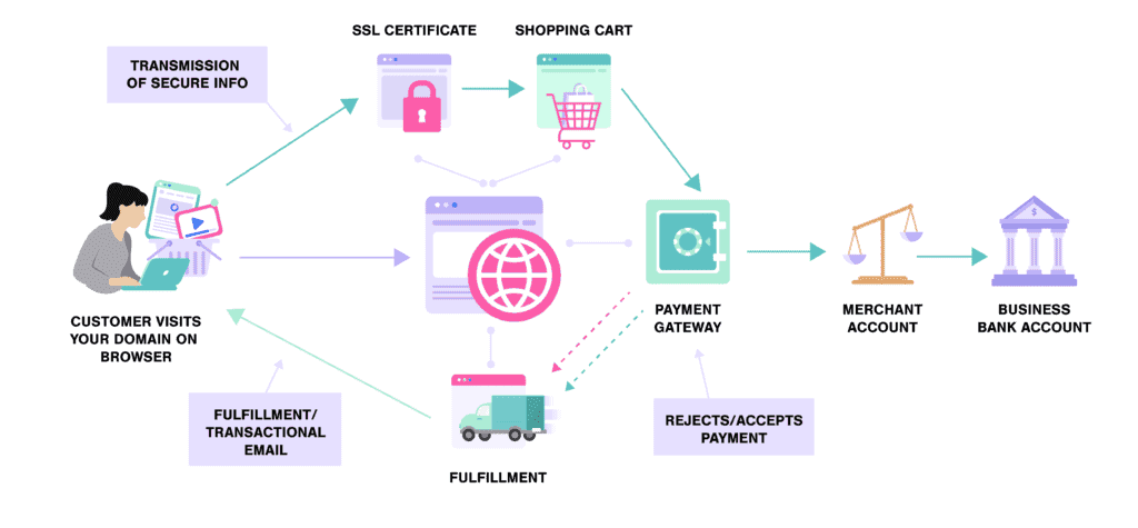
There are multiple types of ecommerce businesses:
Take your website to the next level with award-winning design.
Get my custom quoteEcommerce Website Design vs Traditional Website Design
Ecommerce Website Design
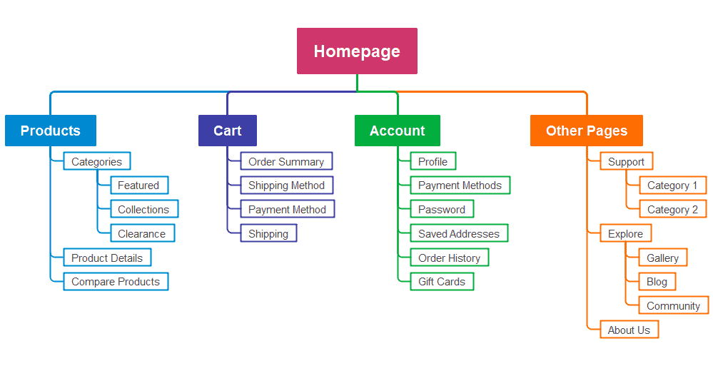
Here is an example of an ecommerce website sitemap:
Traditional Website Design
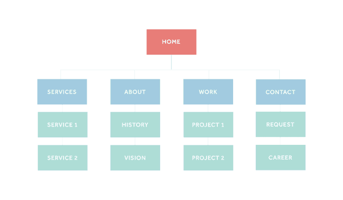
Here is a general layout of a website design:
How to Design an Online Store
1. Ecommerce Platform
Selecting the right ecommerce platform for your site is the first step that’s often ignored by a lot of businesses. There are several ecommerce solutions and content management systems that let you create and design an ecommerce website but not all of them give you the same flexibility in terms of design. The leading ecommerce platforms include:
- WooCommerce
- Squarespace
- Woo Themes
- Shopify
- Wix
- BigCommerce
- 3dcart.
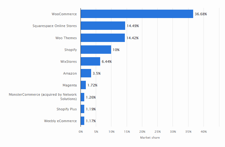
All these platforms offer free and paid themes and templates for ecommerce stores with customization features. But not all of them are created equal.
WooCommerce, for instance, is an open-source ecommerce platform built on WordPress that is extremely flexible with full support for custom ecommerce website designs.
Wix, on the other hand, is the 5th most used ecommerce platform globally that offers everything an ecommerce business needs, but it doesn’t offer unlimited design options. You can use Wix themes and customize them using its editor. And this comes with limitations.
You need to pick the right ecommerce platform. If you are looking for a custom ecommerce website design that’s unique and exactly based on your requirements, you need to choose WooCommerce or Shopify as these are the two most flexible platforms in terms of website design.
If you are interested in ease of use and website maintenance and least concerned about design uniqueness, choose any other platform that offers customized themes and templates, customer support, and add-on features.
2. Be Unique
Make your ecommerce website design unique – significantly unique.
Why?
Uniqueness improves brand identity. The color scheme, font, typography, layout, navigation, theme, and everything else should not just be different but matchless. This helps your target audience differentiate your brand and products from your competitors. A unique design is hard to achieve with ecommerce themes and templates. These are used by hundreds of businesses with minor or major customization.
Here is an example:
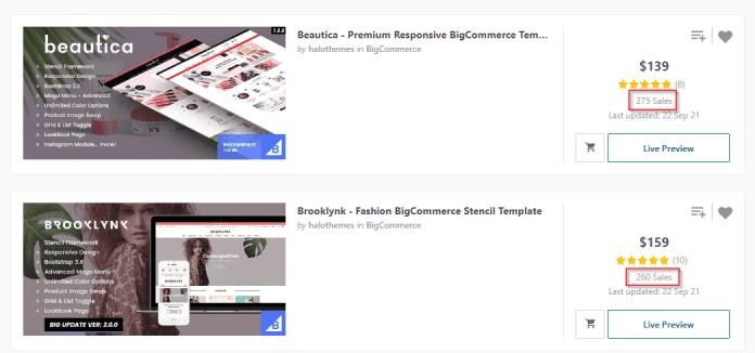
These top BigCommerce themes have been sold to 500 different customers. Though you can customize these themes, you can’t make them unique.
Unique ecommerce website design means:
- Brand identity
- High credibility
- Customer attachment
- Memorable as your customers can easily identify your website at every interaction.
3. Focus on User Experience
Does your ecommerce website design help visitors do what they want?
Great design with poor UX is meaningless. Design should guide users in your store and help them become customers and move towards the bottom of the funnel. If you look at good ecommerce website design examples, you will notice one thing in common: Awesome user experience.
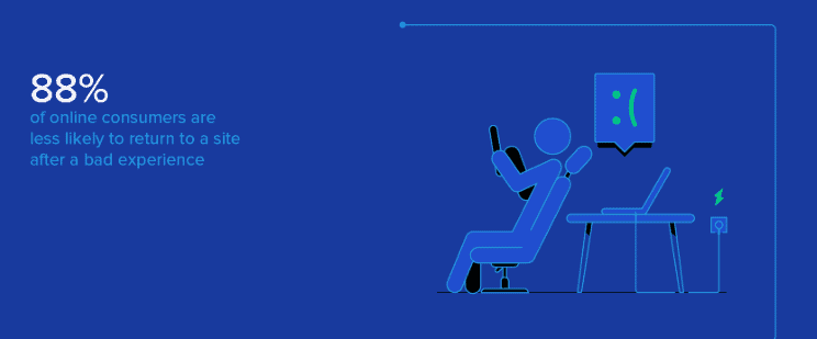
Research shows that 88% of consumers are less likely to return to a website after a bad UX and people who have a negative brand experience on mobile devices are 62% less likely to purchase from that brand:
In another study, only 1% of ecommerce websites meet their expectations every time. UX is embedded within your site design. Follow these guidelines to improve user experience with ecommerce design:
- Make your site easy to navigate
- Offer personalized product recommendations
- Make CTAs prominent
- Use visual cues to guide visitors to the most important sections on a web page
- Add high quality product photos and videos
- Make product descriptions skimmable with subheadings, bullets, and short paragraphs
- Keep forms short and only collect the necessary information
- Offer multiple payment options
- Offer free shipping
- Keep pricing transparent without any hidden charges
- Always tell the visitors what they should expect when they click a button or link.
4. Color Scheme
Website design is mostly driven by color. You need to choose the right, purpose-driven color scheme for your brand and website. Color is known to increase brand recognition by 80% as people relate certain colors to specific brands.
For example, blue and red are associated with Pepsi, blue is linked with IBM, and maroon is associated with Quora.
When you define and choose a color scheme for your brand and ecommerce business, and you use it consistently, it gets easier for your target audience to recognize you as it associates that color with your store specifically.
You need to choose a color scheme smartly for your ecommerce store as colors are related to psychology. Colors impact feelings, mood, perception, and behavior. Here is an overview of what different colors mean:
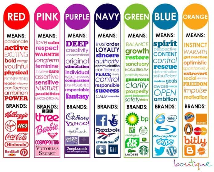
If you have identified a color scheme for your brand, use it in website design. If not, it is time to identify colors that reflect your brand identity and philosophy based on how the color relates to what you sell and do.
Don’t take colors lightly when designing an ecommerce website. The colors you use have a huge impact on your brand and customer perception of your brand.
Do your homework.
5. Use White Space
White space or negative space is empty space around the content, visual, and functional elements on a web page. It is a key element in website design that improves user experience, aesthetics, reading ability, and comprehension.
Here is an example of two types of white space often used in website design:
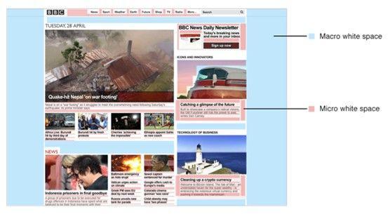
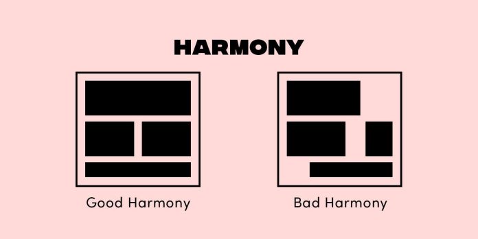
White space creates a visual hierarchy and helps you drive user attention to specific elements on a web page (e.g., a call to action). Here is an example of how white space creates harmony and group elements together:
6. Add Security
Your ecommerce website design must ensure security for the users. Since they have to add their financial information and pay for products, it is essential to provide customers with all the security features they expect.
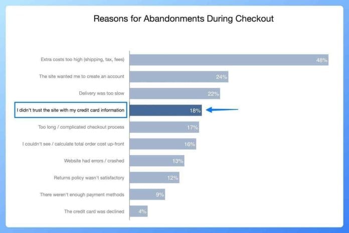
Research shows that 18% of people abandon an ecommerce website during checkout because they don’t trust the site with their credit card information:
Using a trust badge or trust seal on your ecommerce store in the footer, checkout page, and other key areas can significantly improve conversions and sales. A survey found that PayPal is the most trusted trust seal followed by Norton and Verisign:
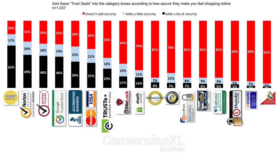
This is a reason why all the great ecommerce website design examples have these security and trust badges.
There are different types of trust badges you can use to make visitors secure:
- Accepted payment badges
- Safe checkout
- Third-party endorsements
- Money back guarantee badges
- Free shipping and returns.
Add these badges on the checkout page, footer, homepage, and product pages. The idea is to make your ideal customers feel secure and safe, so they don’t end up abandoning your ecommerce store due to mistrust.
7. Social Proof
When designing an ecommerce website, don’t forget to add social proof. It builds trust and drives conversions.
As much as 63% of consumers say that they are more likely to buy from a site with product ratings and reviews. Testimonials on a sales page or product page increase sales by 34%. Customer reviews are the most trusted feature for an ecommerce store:
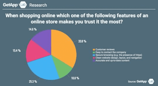
There are several ways to use social proof in ecommerce website design to boost conversion and sales:
- Add reviews and ratings
- Highlight the best reviews for each product
- Add top customer testimonials and endorsements on the home page
- Indicate how many people have purchased a product
- Show recent purchases
- Highlight the best selling product.
8. Optimize Checkout Process
The checkout process is a key concern for ecommerce stores as this is where a lot of people leave. The average online shopping cart abandonment rate is 70%. This means, on average, 70 out of 100 people will never checkout after adding products to the cart.
Why?
Here are the top reasons why customers leave an online store during the checkout process:
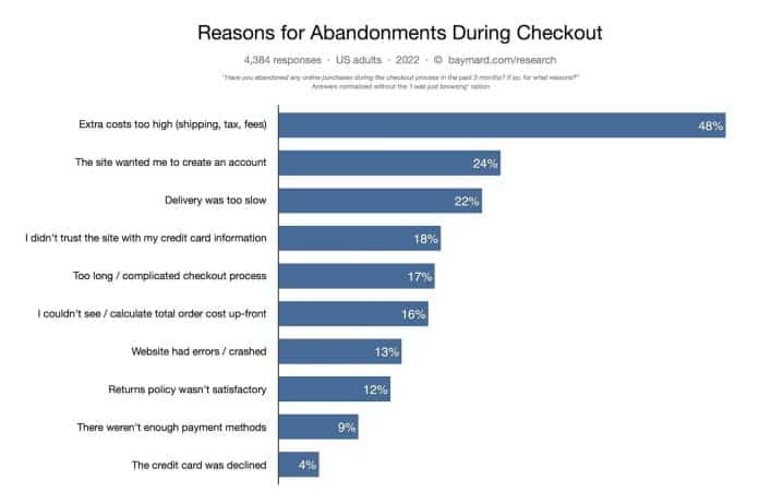
You can easily address most of these issues during the design process. Follow these steps to optimize the checkout process and reduce the abandonment rate significantly:
- Keep the checkout process simple
- Allow guest checkout
- Be transparent with fees and taxes and mention them upfront
- Mention the estimated delivery time right on the product page
- Allow visitors to see the total cost of the order on the product page
- Add multiple payment methods
- Add trust badges on the checkout page.
Here is an example of a nice checkout page that has everything mentioned clearly on a single page:
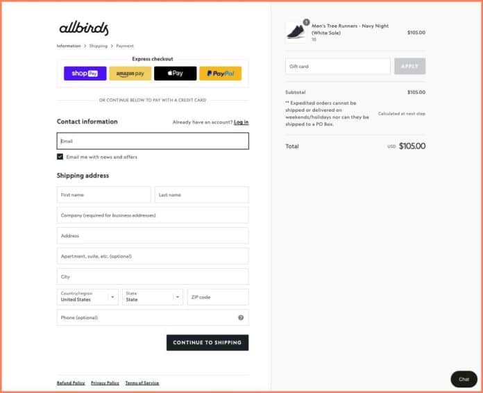
The customers don’t have to move back and forth to find necessary information. Everything is visible on a single page with an express checkout feature.
9. High Quality Product Images
The quality, quantity, and size of product photos on your ecommerce store impact conversion and sales.
Your ideal customers have nothing but product images to make a purchase decision and they have to rely on these photos. The images must be high-quality and relevant to the actual product.
Follow these guidelines for product photos when designing an online retail store:
- Use high quality product images as they convert 3x better and establish trust
- Use large images. A study found that increasing image size by 28% increases conversion rate by 63%
- Adding multiple images increases the conversion rate.
If you can add product videos, that’s great. As much as 33% of consumers prefer learning about a product by watching a video, 69% of people believe that a product demo helps them make a purchase decision, and 80% of consumers say that product videos give them more confidence when shopping for a product online.
Ideally, you should add both product photos and product videos for all the products. Ecommerce web design should cater to both.
10. Experiment
Ecommerce website design isn’t stagnant. It needs to be tested, tweaked, and improved consistently for conversions.
Constant experimentation to improve design will lead to better user experience, higher sales, and more revenue.
You can change most visual and functional elements on your ecommerce website such as CTA position, checkout process, trust badges, content, headlines, etc. Data-driven experimentation to improve design should be a permanent part of your ecommerce design process.
Get a beautiful, functional website optimized for SEO and mobile.
Request a proposalEcommerce Site Design Checklist
1. Homepage
The home page is the first page that potential customers see. It is the front page of your ecommerce store. It represents the face of your brand. It must be catchy and persuasive. The idea is to keep visitors stick and shop from your online store.
Here is a quick checklist to create a stunning home page for your ecommerce store:
- Main product or current offer
- Search bar to allow visitors quickly find what they are looking for
- Categories in the header or sidebar – above the fold
- List of featured and/or recommended products
- A clear and catchy CTA above the fold
- High quality product image in the slider or header.
Here is a great ecommerce website example of a perfect homepage design:
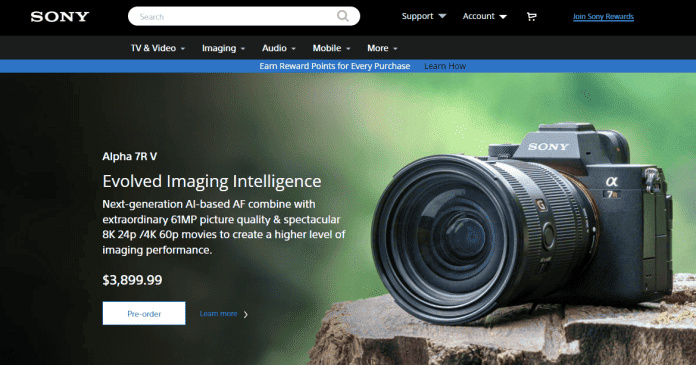
Sony has utilized above the fold area smartly. You find categories, search bar, a notification bar, and their top product with a nice high quality product image.
Above the fold area (that’s instantly visible to the visitors) is very important and you must use it smartly. It should be catchy enough to grab visitor attention immediately. This is the purpose of a home page – to keep visitors hooked and persuade them to scroll down and shop.
2. Product Pages
A product page lists the features, images, specifications, and other details about the product. It is one of the most important pages on your ecommerce store and is responsible for sales. A well-designed and properly structured product page will significantly increase conversions.
Here is an overview of the main elements of a product page:
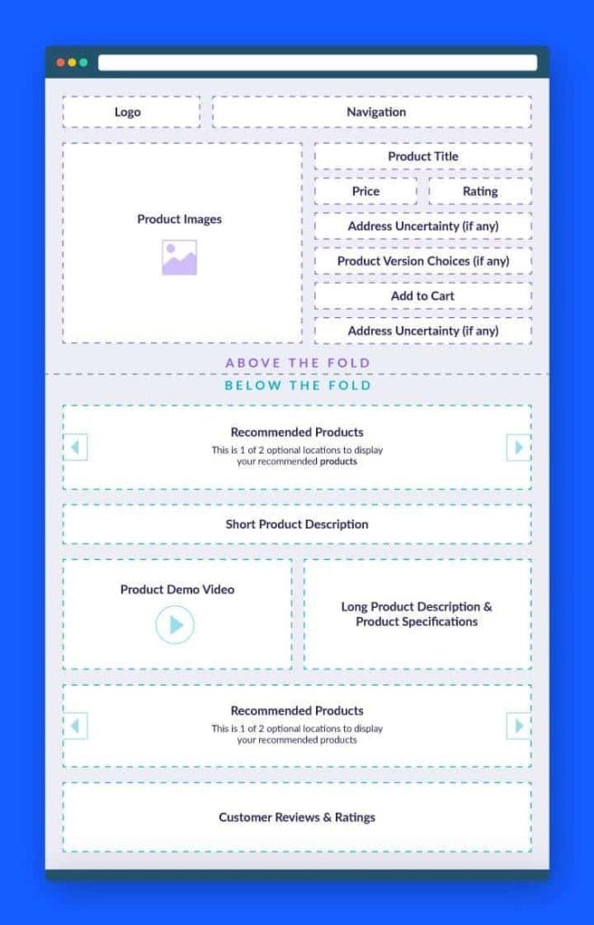
Here is how to design a perfect product page for your online store:
- Several high quality product images
- Product video
- Product title, price, and a CTA above the fold
- Customization features
- Key product benefits
- Detailed product description with specification
- Customer reviews and ratings
- Product recommendations, cross-selling, and bundled products.
Amazon has the perfect product page template that is optimized for conversions. Here is an example:
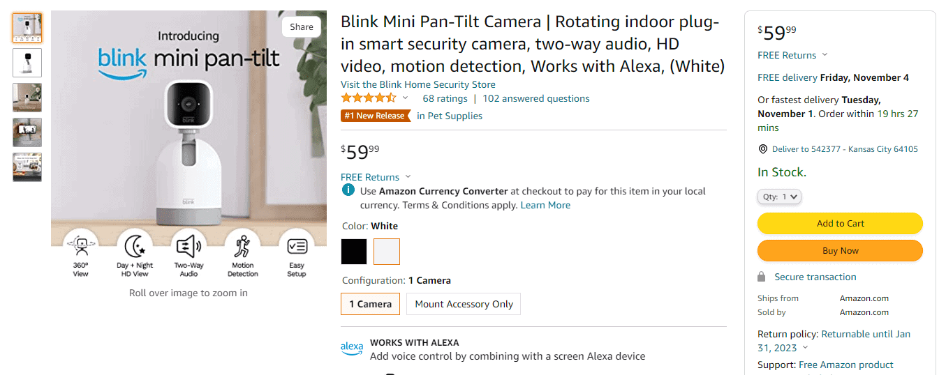
The pages have detailed titles, high quality images, product videos, CTAs, product customization options, and reviews and ratings above the fold. You can view product features in bulleted form and then detailed product description if you scroll deep.
If you want to create amazing pages for your ecommerce store, copy the template from Amazon. You don’t have to create exactly similar pages, but you need to make sure you have all the necessary elements.
3. Landing Pages
A landing page is a standalone page that is focused on selling a single product. Just like any other page, a landing page is a must-have for your ecommerce website.
A landing page is different than a product page. Here is how:
- The purpose of a landing page is to boost conversions, so it promotes a single product
- One product, one offer, and a single clear CTA
- Highly targeted content and headlines
- Restricted menu and links to other parts of the ecommerce store
- Fully optimized for marketing and conversions.
Here is one of the best ecommerce website examples of a landing page:
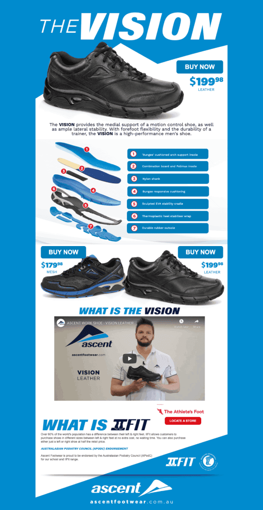
It has a clear purpose without any links to other pages on the store. These types of highly targeted landing pages are needed for marketing purposes and help you with:
- New product launches
- PPC campaigns
- Targeted marketing campaigns
- Target customized products based on the customer lifecycle stage
- Testing and experimentation
- Boost sales and conversions.
Since landing pages are clutter-free and targeted, they perform better than product pages especially if you are driving paid traffic. Follow these best practices to design perfect landing pages:
- Create multiple landing pages. The more landing pages you have, the better as it lets you get more insights
- Have a clear objective for every landing page you create
- Promote one product with an extremely specific headline, benefits, and description
- Reduce distractions. Remove navigation, product recommendations, and links to any other external pages
- Add CTA above the fold
- Keep your landing page short. No need to add the full product description. Use key benefits only.
4. Checkout Page
This is the page that’s responsible for the sales. And a good number of potential customers (after adding products to the cart) leave your online store from the checkout page.
A well-designed, transparent, and secure checkout page is just the bare minimum to boost conversions. Here is a layout of a perfectly designed and optimized checkout page for ecommerce stores:
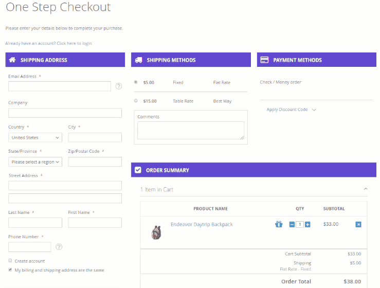
It is a single-step checkout page that’s ideal for conversions. It is short and has all the necessary details. A lot of potential customers abandon an ecommerce store due to the long checkout process, hidden costs, unavailability of available payment methods, and lack of guest checkout option.
So, you must ensure the following:
- Your checkout page must be short and crisp
- Keep it to one page. Or add a progress indicator for long checkout pages
- Offer guest checkout
- Clearly mention all types of costs upfront. Don’t add hidden costs at this stage
- Add multiple payment methods
- Offer express checkout with a single tap or click
- Add trust signals
- Reduce distractions and remove all external links
- Use exit intent popups to collect email addresses so you can contact them later in case of abandonment or any other issue.
You don’t just need a checkout page, but you need an optimized page that converts like crazy.
5. Category Pages
A category page consists of a group of related products. It is used to organize similar products and make them easily accessible to site visitors. A product page deals with a single product while a category page lists all the products within a category.
Here is an example of a category page:
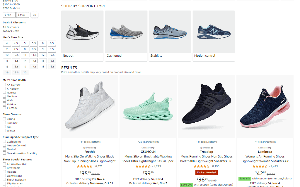
Amazon has perfectly designed product category pages that show you a product image, price, review and rating, and shipping details. Additionally, you can apply search filters to sort products based on your choice. This is the best way to boost user experience and let potential customers find what they are looking for with just a few clicks.
A category page is much more important than a product page. The conversion doesn’t happen on a category page, but it sends traffic to a relevant product page. And therefore, it does impact conversions and UX.
Product category pages play a crucial role in navigation, site structure, UX, and search engine optimization. These pages help web crawlers understand site hierarchy and organization. On the other hand, it helps visitors find relevant products within a category easily.
Follow these best practices to design amazing category pages that meet both ends without an issue:
- Create a well-defined and organized hierarchy for category pages
- Add unique content for each category page
- Allow advanced search filters so visitors can quickly find products they are interested in. Look at Amazon and see how it offers tons of filters on its category pages
- Add images with basic information and price on category pages. Don’t hide key information about products to avoid invalid clicks
- Open all products in a new window
- Keep category page URL descriptive and user-friendly.
6. About Us Page
Imagine a person visiting your store for the very first time and there isn’t an about page. You will lose a potential customer.
Why?
Because your target audience wants to know about you, your brand, your physical address, and a lot of details about your ecommerce site. You need to develop trust and it can’t be done without an ‘about us’ page.
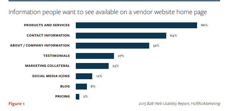
This page mentions everything about your business, journey, history, values, mission, and much more. It builds trust and boosts credibility. A study found that the first thing 52% of people see on a website is its ‘about us’ page:
Don’t take it lightly.
Here is a great example of an about page:
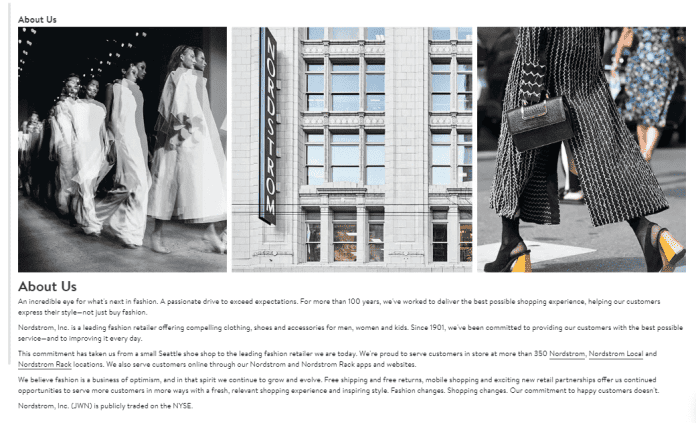
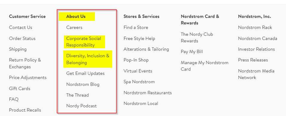
It is a simple and short about us page. Nordstrom has linked to its about us page and other related pages from the footer menu like this:
A giant like Amazon that’s already popular throughout the globe has a dedicated subdomain for its about us section:
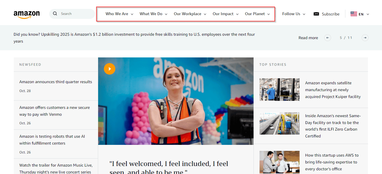
This clearly shows the importance of having a well-crafted and designed about us page. When global leaders are doing it, you shouldn’t ignore it.
Here is an overview of how to design a perfect about us page for online stores:
- Create a dedicated about us page
- Add links to your about us page in the primary, secondary, and footer menus
- Tell your complete story and history
- Talk about your team, product lines, and values
- Share the future of your store and where you see it after a few years
- Use storytelling and try to build an emotional connection with your audience
- Add high quality images and photos of your company, offices, and team
- Keep it short, interesting, and user-friendly.
7. Contact Page
Over 64% of people want to see contact information on an ecommerce store. This is specifically true for click-and-mortar businesses that have no physical outlets. Consumers want to make sure they are buying from a real store that has shared all its contact information so they can contact you in case of an issue.
Here is an example of a contact page:
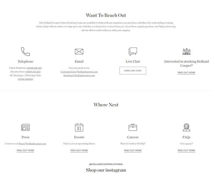
Holland Cooper has a nice and simple contact page with all the necessary information on how to contact support and the company. This is what exactly your audience needs from you – a simple way to get in touch.
The contact page also plays a key role in search engine optimization as search engines use information from your contact page in search result pages.
Follow these design best practices for your online store’s contact page:
- Keep it simple and accessible
- Provide all the relevant contact information including address, email addresses, phone numbers, and contact form
- Add a link to customer support, live chat, knowledge base, FAQs, and other relevant resources where people can find answers to their queries
- Include a link to the contact page in the menus and footer of your store. Make it prominent
- Always add the timing for phone calls with the appropriate time zone.
Not all consumers will contact you, but most of them do visit the contact page to gauge your business’s authenticity. A lot of ecommerce stores don’t have a physical address and they don’t mention any phone numbers, all they have is a tiny contact form.
This is a red flag.
You might not be a scam. But potential buyers might consider you one.
Put yourself in the customer’s shoes. All they want is a guarantee that they are buying from a reputable and credible company that won’t run away with their money. And in case of an issue, they can reach out and get their concerns noticed.
Don’t take the contact page lightly. Make it one of the best pages on your store.
Transparent web design pricing tailored to your business needs.
Book a free consultationHow Much Does It Cost to Design Great Ecommerce Websites
If you are using an ecommerce template or theme, it will cost you under $200 to buy and use a theme and have it fully customized as per your needs.
Custom ecommerce web design services cost you anywhere between $10,000 and $50,000 or more. The actual price of a custom ecommerce website design depends on your specific requirements.
If you are interested in minor tweaks to an existing ecommerce theme, you can have it done for under $2,000. However, if you need a custom design from scratch with complete coding and editable design files, it will cost you a few good thousand dollars.
It comes down to what you need and your budget:
- Ecommerce themes are cost-effective but provide limited functionality and aren’t unique. These are ideal for small ecommerce businesses with limited budgets that aren’t too concerned about building brand and credibility
- Custom ecommerce web designs are unique, customizable, and fully scalable. These are suitable for ecommerce businesses that are interested in building a unique, identifiable, and credible brand.
If you have a custom ecommerce site design request and have no clue how much it would cost, you can reach out to a few agencies and get quotes. When you receive quotes, don’t just compare price – compare services offered and outcome.
Ecommerce Web Design Services by NEWMEDIA
At NEWMEDIA, we offer ecommerce website design services to businesses of all sizes and budgets. It doesn’t matter if you need a minor tweak in your existing ecommerce theme or need a new customized ecommerce website designed from scratch, we have got you covered.
You’ll have the opportunity to work directly with the website design team to make suggestions and approvals before anything is finalized. There is no cookie-cutter approach for this process: It’s customized to fit your needs as an individual and a business. We’ve found this to be most effective and enjoyable for everyone.
In digital marketing, everything is connected: Your website, social media accounts, and advertising campaigns should align with a clear message. As a full-service digital agency, we understand those connections because we work with them every day, and we’ll design your ecommerce site with that in mind.
Our Ecommerce Design Process
Step 1
Step 2
Step 3
Step 4
Step 5
Step 6
Step 7
Step 8
Step 9
After You Launch Your Ecommerce Website
Don’t forget about visitors and optimization. We are experts in driving organic traffic with ecommerce SEO, and managing paid traffic with ecommerce PPC, and in order to maximize the value of all those website visitors you should consider ecommerce website optimization as well.
Turn your website into a revenue driver with our expert design and marketing services.
Get my custom website quote
